Behind The Scenes: A Food Company

Last year, I was contacted by a company to create test images. I won’t reveal their name, but maybe you’ll recognize the product. ;-) I was surprised they chose me for this project, as they were known for a very classic and traditional style. However, during a phone call, the marketing manager explained that they wanted to test a fresh and youthful direction for an upcoming product line.
I liked the idea right away. After sending a quote, I started working immediately. The new product came in several flavors, but for the test series, they only wanted to visually represent one flavor that they found harder to imagine.
As this was a test shoot, the goal was to create three simple images to keep the budget low. During our first meeting, we looked at their mood board, and it was nice to see that they liked many of my works.
Based on that, I created my own mood board and developed new ideas, including sketches. I usually write down my ideas in detail — props, lighting, colors, and backgrounds, so the client knows exactly what to expect. They immediately liked the sketches, but didn’t want any white balls in the images. (Personally, I didn’t think they were strictly necessary either, but since the products and sets were quite angular, I wanted to break that with a softer shape—like a curved shadow.) No problem, I adapted the sketches and started preparing the sets.
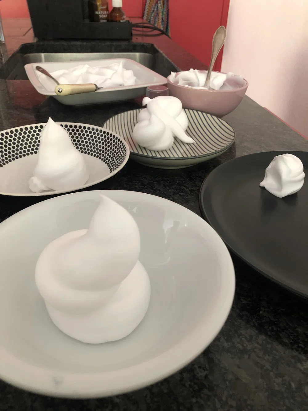
Because the budget was limited, I mostly used materials I already had in the studio. The only exception was the cream. I wanted to test the real product, so I tried different types of whipped cream. The results were only partly satisfying. Still, I found one that worked okay and planned to use it on the shoot day. Just in case, I also tried shaving foam afterward, which looked better visually. :-D
Finally, the shoot day arrived. Cream and shaving foam were ready. First image: with cream - the client was immediately unhappy. :-D Shaving foam won the race. I had a lot of fun on this shoot and took my time to get everything just right.
The images were in the can, and post-processing could begin. I didn’t have to do much, and the client was thrilled. So, I sent them the final files.
A few months later, I received feedback that they decided to stick with their traditional style after all. It happens. Luckily, I’m allowed to publish the images and use them in my portfolio.
All’s well that ends well. See some of the images here.
See you soon,
Rachel
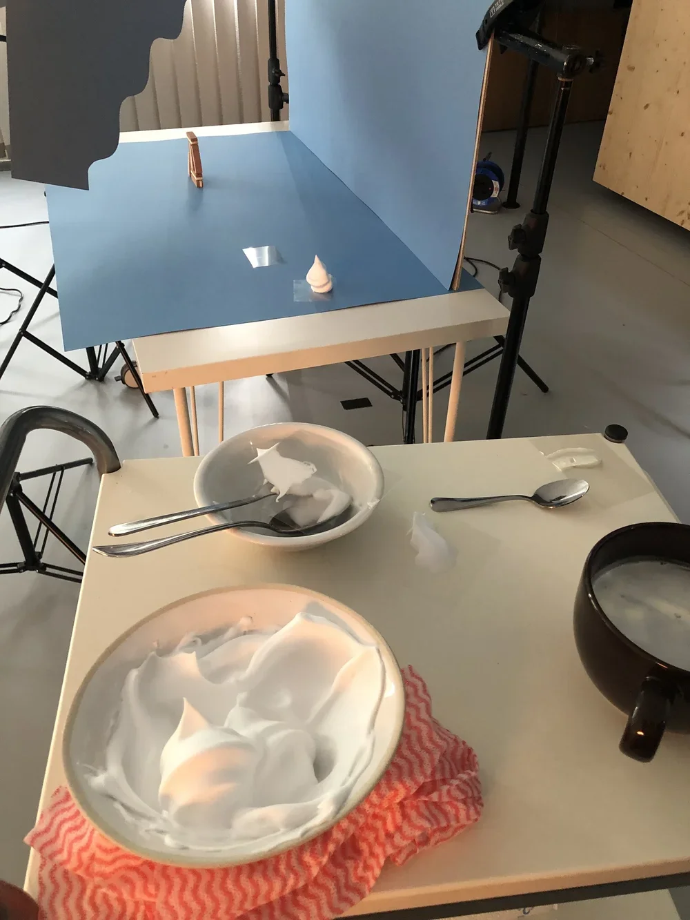
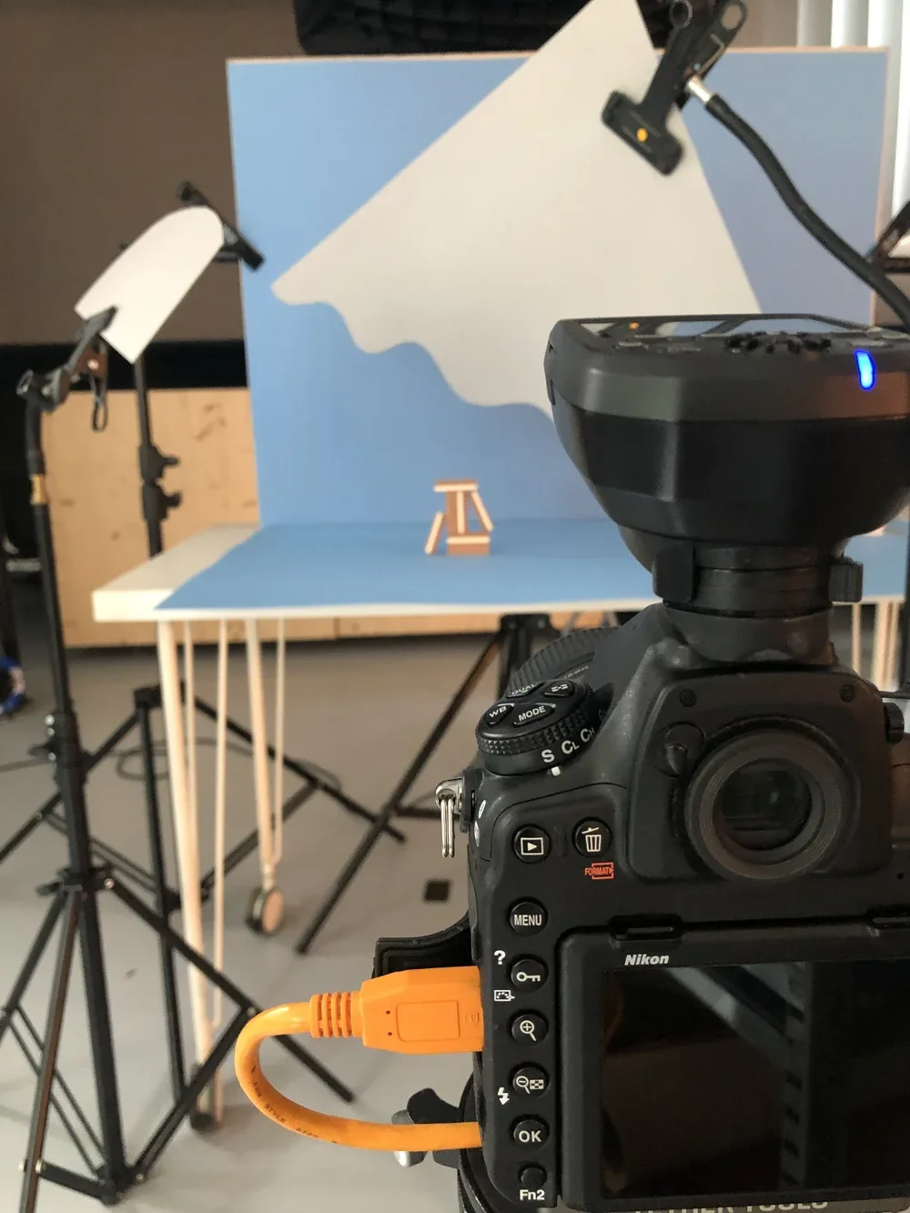
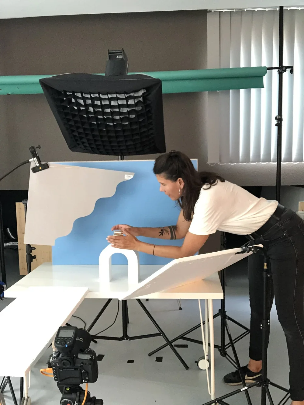
(see behind the scenes image below)
Hinter den Kulissen: Lebensmittelunternehmen
Letztes Jahr wurde ich von einer Firma kontaktiert, um Testbilder zu erstellen. Den Namen des Unternehmens werde ich nicht verraten, aber vielleicht erkennt ihr es am Produkt. ;-) Ich war überrascht, dass sie mich für dieses Projekt auswählten, da sie bisher für ihren sehr klassischen und traditionellen Stil bekannt waren. Die Marketingleiterin erklärte mir jedoch bei einem Telefonat, dass sie eine neue und junge Richtung für eine bald zu launchende Produktlinie testen wollten.
Die Idee gefiel mir: Nachdem ich ein Angebot erstellt hatte, begann ich sofort mit der Arbeit. Das neue Produkt umfasste verschiedene Geschmacksrichtungen, aber für die Testreihe wollten sie nur eine Geschmacksrichtung bildlich darstellen, die sie sich weniger konkret vorstellen konnten.
Im Sinne eines Testshoots war das Ziel, drei einfache Bilder zu gestalten, um das Budget niedrig zu halten. Schon im ersten Gespräch haben wir ihr Moodboard angeschaut und es war schön zu sehen, dass ihnen viele meiner Arbeiten gefielen.
Auf dieser Grundlage konnte ich ein eigenes Moodboard erstellen und neue Ideen entwickeln, wobei ich Skizzen anfertigte. Dabei notiere ich oft meine Ideen inklusive Requisiten, Lichtsetzung, Farben und Hintergründen ganz genau, damit meine Kundschaft genau weiß, was sie erwartet. Die Skizzen fanden sofort Gefallen, allerdings wollten sie keine weißen Bälle im Bild haben. (Persönlich fand ich diese auch nicht zwingend notwendig, aber da die Produkte und Sets eher eckig waren, wollte ich eine Form, die das etwas bricht. Hier hilft ein kurviger Schatten) Kein Problem – ich passte die Skizzen an und machte mich daran, die Kulissen vorzubereiten.
Da das Budget begrenzt war, nutzte ich hauptsächlich Material, das ich bereits im Studio hatte. Einzig die Sahne musste ich testen. Am liebsten nutze ich das echte Produkt, also testete ich verschiedene Schlagsahne. Das Ergebnis war leider nur halb zufriedenstellend. Trotzdem fand ich eine Schlagsahne, die nicht schlecht funktionierte, und plante, diese am Shootingtag zu verwenden. Zur Sicherheit probierte ich anschließend noch Rasierschaum aus, der sich als optisch besser herausstellte. :-D
Endlich war der Tag des Fotoshootings gekommen. Sahne und Rasierschaum standen bereit. Das erste Bild: mit Sahne: Die Kundschaft war sofort unzufrieden. :-D Der Rasierschaum gewann das Rennen. Ich hatte viel Spaß bei diesem Shooting und nahm mir die Zeit, alles genau hinzubekommen.
Die Bilder waren im Kasten und die Nachbearbeitung konnte beginnen. Viel musste ich hier nicht mehr machen, und die Kundschaft war begeistert. Also sendete ich ihnen die finalen Daten.
Einige Monate später erhielt ich Feedback, dass sie doch beim traditionellen Stil bleiben wollen. Kann passieren. Zum Glück darf ich die Bilder veröffentlichen und für mein Portfolio nutzen.
Ende gut, alles gut. Siehe einige Bilder hier.
Bis bald,
Rachel